
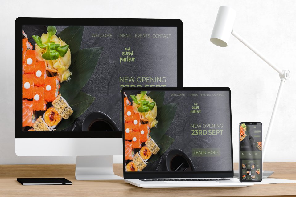
Welcome to the comprehensive guide to creating user-friendly websites through the mastery of responsive web design. In this fast-paced digital era, it’s no longer enough for websites to merely look good on desktop computers. They should adapt seamlessly to various screen sizes and devices, providing an optimal user experience across the board. Enter responsive web design – a technique that enables websites to automatically adjust their layout and content based on the user’s device.
In this guide, we’ll dive deep into the art of responsive web design, exploring the fundamental principles and best practices that will help you craft websites that look stunning and function flawlessly on any screen. From flexible grids and media queries, to fluid images and touch-friendly navigation, we’ll cover it all. Whether you’re a seasoned web designer looking to expand your skillset or a business owner aiming to create a user-centric website, this guide has got you covered.
Unlock the secrets to mastering responsive web design and take your websites to the next level. Get ready to create visually appealing, highly accessible, and engaging user experiences that leave a lasting impression. Start your journey towards web design excellence now.
Understanding responsive web design
Responsive web design is a design approach that ensures websites adapt to different screen sizes and devices, providing an optimal viewing experience. With the increasing use of smartphones and tablets, it has become crucial for websites to be accessible and visually appealing across various devices. Responsive web design achieves this by using flexible grids, fluid images, and CSS media queries to alter the layout and design elements based on the screen size. This approach eliminates the need for separate mobile versions of websites and ensures a consistent user experience.
One of the key benefits of responsive web design is improved search engine visibility. Search engines like Google prioritize mobile-friendly websites in their search results, making responsive design an essential factor for SEO. Additionally, responsive websites are easier to maintain as changes made to the main website automatically apply to all devices, saving time and resources. By mastering responsive web design, you’ll be able to create websites that are both user-friendly and search engine optimized.
Why responsive web design is important
In today’s mobile-first world, having a responsive website is no longer an option but a necessity. The statistics on mobile usage speak for themselves. According to Statista, as of 2021, more than 54% of global website traffic comes from mobile devices. This number is projected to increase in the coming years. With such a significant portion of users accessing the web through mobile devices, having a responsive website is crucial to providing a positive user experience.
A responsive website ensures that users can easily navigate, read, and interact with your content regardless of the device they are using. It eliminates the need for zooming in or scrolling horizontally, creating a seamless and intuitive experience. By optimizing your website for mobile devices, you can increase user engagement, reduce bounce rates, and ultimately drive more conversions.
Statistics on mobile usage and the need for responsive design
In today’s mobile-driven world, it’s essential to understand the significance of responsive web design. Mobile usage has skyrocketed in recent years, with people relying on their smartphones and tablets for browsing the internet. According to Statista, the number of mobile phone users worldwide is projected to reach 7.26 billion by 2023. With such a vast audience accessing websites through mobile devices, it’s crucial to ensure that your website is responsive.
Responsive design is not just a trend; it’s a necessity. Google has made mobile-friendliness a ranking factor, prioritizing websites that provide an excellent user experience on mobile devices. Additionally, studies have shown that users are more likely to abandon websites that don’t display properly on their phones or tablets. By implementing responsive web design techniques, you can tap into the growing mobile market and provide a seamless experience for your users.
Creating a responsive website is not only about accommodating different screen sizes but also about considering the user’s context. People use mobile devices on the go, often with limited attention spans. Responsive design allows you to optimize your content for quick consumption, making it easier for users to navigate and find what they need. By understanding the statistics and recognizing the need for responsive design, you’re already one step closer to creating user-friendly websites.
Key principles of responsive web design
To master responsive web design, it’s crucial to grasp the key principles that underpin this approach. These principles serve as the foundation for creating websites that adapt and respond to different devices. Let’s explore three fundamental principles that will guide you in your responsive web design journey.
1. Flexible Grids: One of the core principles of responsive design is the use of flexible grids. Instead of fixed pixel-based layouts, responsive websites utilize proportional grids that can adapt to different screen sizes. By using relative units such as percentages or ems, you can ensure that the layout adjusts smoothly across devices. Flexbox and CSS Grid are powerful tools that can help you create flexible grids that automatically rearrange content based on the available space.
2. Media Queries: Media queries allow you to apply different styles based on the characteristics of the user’s device. By using CSS media queries, you can define breakpoints at which the layout and design of your website will change. This enables you to optimize the user experience for various screen sizes and orientations. Media queries can target specific devices or ranges of devices, ensuring that your website looks and functions flawlessly across a wide range of devices.
3. Progressive Enhancement: Progressive enhancement is an approach that focuses on building a solid foundation for all devices and then adding enhancements for more capable devices. This means starting with a basic layout and functionality that works on all devices and progressively enhancing the design and features for devices with more capabilities. By following this approach, you can ensure that your website is accessible to all users, regardless of their device or browser.
By embracing these key principles of responsive web design, you’ll be well-equipped to create websites that are not only visually appealing but also highly adaptable to different devices and user contexts.
Planning your responsive web design project
Before diving into the technical aspects of responsive web design, it’s essential to have a well-thought-out plan. Planning lays the foundation for a successful project and helps you stay organized throughout the design and development process. Here are some key steps to consider when planning your responsive web design project.
1. Define Your Target Audience: Understanding your target audience is crucial for creating a user-friendly website. Identify the devices and screen sizes your audience is likely to use and prioritize your design accordingly. Conduct user research and gather insights to inform your design decisions.
2. Content Audit and Strategy: Perform a thorough content audit to assess the existing content and identify areas that need improvement. Consider the hierarchy of your content and how it will adapt across different devices. Develop a content strategy that aligns with your responsive design goals.
3. Wireframing and Prototyping: Wireframing and prototyping allow you to visualize the layout and functionality of your website before diving into the development stage. Use tools like Sketch or Adobe XD to create wireframes and interactive prototypes that showcase how your website will respond to different devices.
4. Design System and Style Guide: Establish a design system and style guide to ensure consistency across your responsive website. Define typography, colors, spacing, and other design elements that will be used consistently throughout the website. This helps maintain a cohesive visual identity across different devices.
5. Collaboration and Communication: Responsive web design projects often involve multiple stakeholders, including designers, developers, and content creators. Establish clear lines of communication and collaboration to ensure everyone is aligned with the project goals and timelines.
By investing time in careful planning, you’ll set yourself up for success and create a roadmap for the rest of your responsive web design journey.
Techniques for creating responsive layouts
Creating responsive layouts is at the heart of responsive web design. It involves designing and structuring the content in a way that adapts to different screen sizes and orientations. Here are some techniques and best practices to help you create responsive layouts that provide an optimal user experience.
1. Mobile-First Approach: The mobile-first approach involves designing for mobile devices first and then progressively enhancing the design for larger screens. This approach ensures that your website is optimized for smaller screens and focuses on delivering essential content and functionality. As the screen size increases, you can add more complex features and layouts.
2. Fluid Grids and Flexible Units: Use fluid grids and flexible units to create responsive layouts that adapt to different screen sizes. Instead of using fixed pixel widths, use relative units like percentages or ems. This allows the layout to adjust proportionally based on the available space. CSS Grid and Flexbox are powerful tools that enable you to create flexible and responsive grid systems.
3. Responsive Images: Images play a crucial role in web design, and optimizing them for responsive layouts is essential. Use CSS techniques like `max-width: 100%` to ensure that images scale proportionally based on the container size. Additionally, consider using responsive image formats like WebP or JPEG 2000 to further reduce file sizes and improve loading times.
4. Media Queries and Breakpoints: Media queries allow you to apply different styles based on the characteristics of the user’s device. Define breakpoints at which the layout will change, and apply appropriate styles to ensure a seamless experience across devices. Consider factors like screen size, orientation, and resolution when defining your breakpoints.
5. Mobile Navigation Patterns: Navigation is a critical aspect of user experience, particularly on mobile devices. Use touch-friendly navigation patterns like off-canvas menus, hamburger menus, or bottom navigation bars to ensure ease of use on smaller screens. Consider the placement and visibility of navigation elements to optimize the user flow.
By implementing these techniques, you can create responsive layouts that adapt seamlessly to different devices, providing users with a consistent and user-friendly experience.
Optimizing images and media for responsive design
Optimizing images and media is an essential aspect of responsive web design. Large file sizes and slow loading times can negatively impact the user experience, especially on mobile devices with limited bandwidth. Here are some strategies for optimizing images and media for responsive design.
1. Image Compression: Compressing images is crucial for reducing file sizes without compromising image quality. Use image compression tools like TinyPNG or JPEGmini to optimize your images. Additionally, consider using modern image formats like WebP or JPEG 2000, which offer superior compression and smaller file sizes compared to traditional formats like JPEG or PNG.
2. Lazy Loading: Lazy loading is a technique that defers the loading of non-critical images or media until they are actually needed. This helps improve the initial page load time and reduces the overall bandwidth usage. Use JavaScript libraries like LazyLoad or built-in browser features like `loading=”lazy”` to implement lazy loading for images and media.
3. Responsive Video Embeds: Videos are often a central part of web content, and it’s essential to optimize them for responsive layouts. Use responsive video embeds, such as those provided by YouTube or Vimeo, to ensure that videos adapt to different screen sizes. Additionally, consider using video formats that offer better compression, such as H.264 or VP9.
4. Retina and Hi-DPI Displays: Retina and Hi-DPI displays have become increasingly common, and it’s crucial to provide high-quality images for these devices. Use CSS techniques like `@media` queries with high-resolution images to ensure that users with retina or Hi-DPI displays get the best possible image quality.
5. Image Accessibility: Accessibility is a vital consideration in web design. Ensure that your images have appropriate alternative text (alt text) that describes the content of the image. This helps visually impaired users understand the context of the image. Additionally, consider using descriptive captions or transcripts for images that convey important information.
By following these optimization strategies, you can ensure that your images and media load quickly and look great on any device, enhancing the overall user experience.
Testing and debugging responsive websites
Testing and debugging are crucial steps in the responsive web design process. They help identify issues and ensure that your website functions flawlessly across different devices and screen sizes. Here are some key testing and debugging techniques to consider.
1. Device Testing: Test your responsive website on various physical devices and screen sizes to ensure optimal performance. Use both iOS and Android devices, as well as different versions of popular browsers, to cover a wide range of user scenarios. Consider using device testing platforms like BrowserStack or CrossBrowserTesting for comprehensive testing.
2. Browser Developer Tools: Browser developer tools are invaluable for testing and debugging responsive websites. They allow you to simulate different screen sizes, orientations, and device metrics directly in your browser. Use the responsive design mode in Chrome DevTools or similar features in other browsers to preview and debug your responsive layouts.
3. Validation and Performance Testing: Validate your HTML, CSS, and JavaScript code to ensure compliance with web standards. Use tools like the W3C Markup Validation Service or CSSLint to check for any errors or warnings. Additionally, perform performance testing to identify potential bottlenecks and optimize your website’s loading speed.
4. User Testing: User testing involves gathering feedback and insights from real users to evaluate the usability and effectiveness of your responsive website. Conduct usability tests, surveys, or interviews to understand how users interact with your website on different devices. Use the feedback to make informed design decisions and improve the overall user experience.
5. Debugging Tools: When issues arise, debugging tools come to the rescue. Use browser developer tools to inspect and debug specific elements or styles that may not be behaving as expected. Tools like Chrome DevTools or Firefox Developer Tools provide a wealth of features to help you identify and fix responsive design issues.
By thoroughly testing and debugging your responsive website, you can ensure that it delivers a seamless user experience across different devices and screen sizes.
Tools and resources for responsive web design
Responsive web design is a rapidly evolving field, and there are numerous tools and resources available to help you stay up-to-date and streamline your workflow. Here are some essential tools and resources for responsive web design.
1. CSS Frameworks: CSS frameworks like Bootstrap or Foundation provide a solid foundation for building responsive websites. They offer pre-built components, responsive grids, and CSS helpers that simplify the responsive design process. Explore different frameworks and choose the one that best suits your project requirements.
2. Responsive Testing Tools: Use responsive testing tools to preview and test your website across different screen sizes and devices. Browser developer tools like Chrome DevTools and Firefox Developer Tools offer built-in responsive design modes. Additionally, tools like Responsinator or Am I Responsive provide quick previews of how your website looks on various devices.
3. Design and Prototyping Tools: Design and prototyping tools help you visualize and iterate on your responsive web designs. Popular tools like Sketch, Adobe XD, or Figma offer features specifically designed for responsive design, such as artboards, responsive resizing, and interactive prototyping.
4. Media Query Generators: Media query generators are helpful tools for generating CSS media queries based on specific device breakpoints. They allow you to define custom breakpoints and generate the corresponding media queries without manually calculating the values. Tools like the Responsive Breakpoints Generator or the Media Query Generator can save you time and ensure accuracy.
5. Online Communities and Blogs: Engaging with online communities and blogs dedicated to responsive web design is a great way to stay updated and learn from others. Join forums like Stack Overflow or web design-related subreddits to ask questions and share insights. Follow popular web design blogs like Smashing Magazine or A List Apart for valuable articles and tutorials.
By leveraging these tools and resources, you can streamline your responsive web design workflow and stay current with the latest trends and techniques.
Conclusion: The future of responsive web design
Responsive web design has become a fundamental approach for creating user-friendly websites in today’s mobile-driven world. As the number of mobile users continues to rise, the need for responsive design will only grow stronger. Embracing responsive web design principles and best practices allows you to provide a seamless user experience across devices, ensuring accessibility and user satisfaction.
As technology continues to advance, the future of responsive web design looks promising. New techniques and tools will emerge, enabling even more innovative and engaging user experiences. However, the core principles of responsive design – flexible grids, media queries, and progressive enhancement – will remain essential.
At Emerging Freelancer, we specialize in providing top-notch Responsive Website Design Services tailored to your specific needs and preferences. Our team of experienced designers and developers is committed to creating websites that not only look stunning but also adapt seamlessly to various devices and screen sizes. With a keen focus on responsive web design guidelines, we ensure that your website delivers an exceptional user experience across desktops, laptops, tablets, and smartphones. By incorporating fluid grids, flexible images, and media queries, we guarantee that your website remains visually appealing and functional regardless of the device used to access it. Trust EmergingFreelancer.com to elevate your online presence with our expert Responsive Website Design Services.